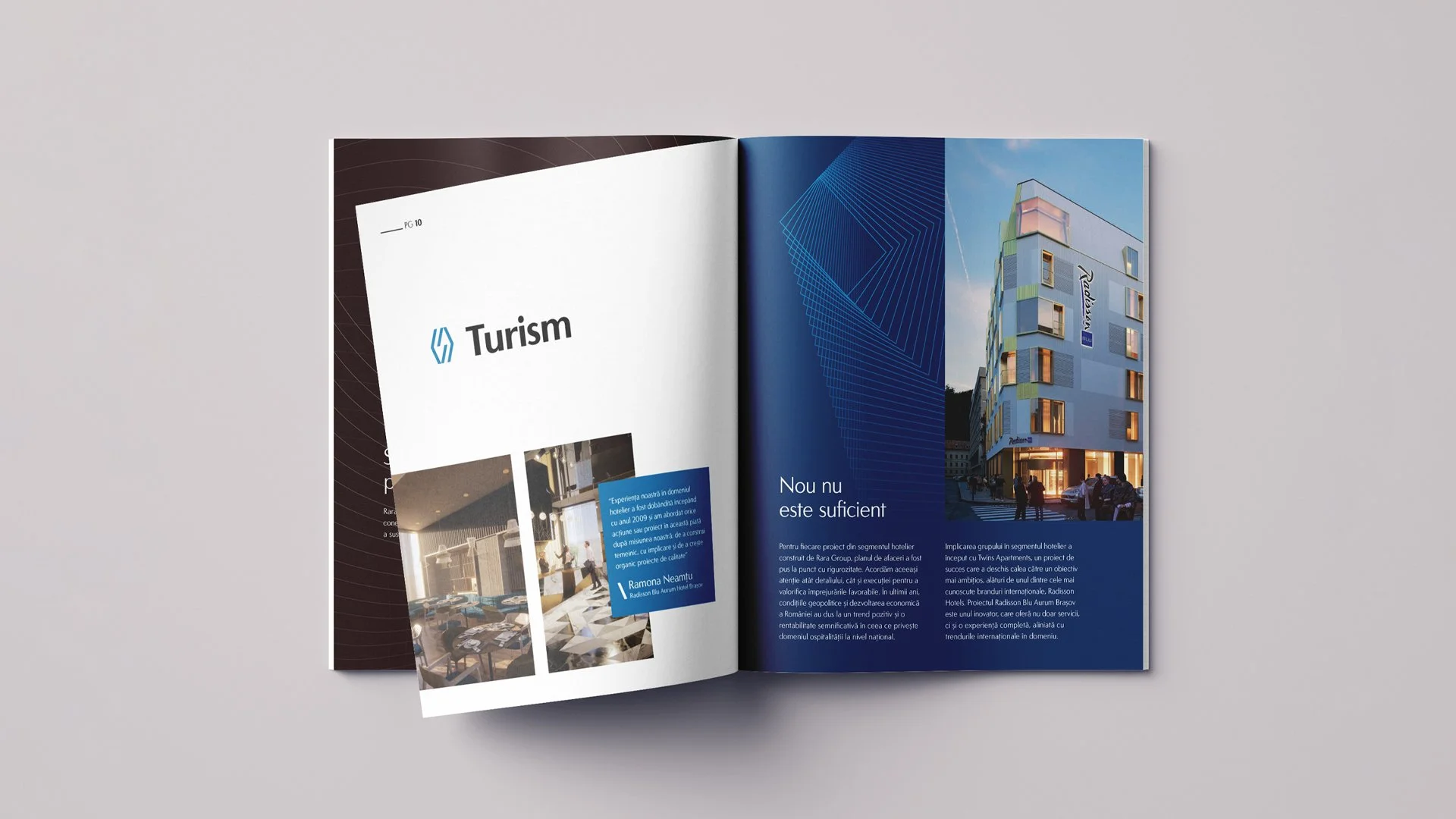
Rara Group
Rara Group is a group of Romanian companies founded in Brașov 30 years ago as a family business. The group includes businesses that operate in fields such as energy, tourism, production, and development. Rara Group creates authentic and lasting partnerships by offering a system of interconnected services based on balance, performance, and innovation.
Rara Group needed a rebranding that would better reflect their modern approach to meeting their customer's needs and clarify the various fields in which they operate.
For this project, Noyk invited me to be part of the branding team.
Services provided
Brand Strategy
Brand Identity Design


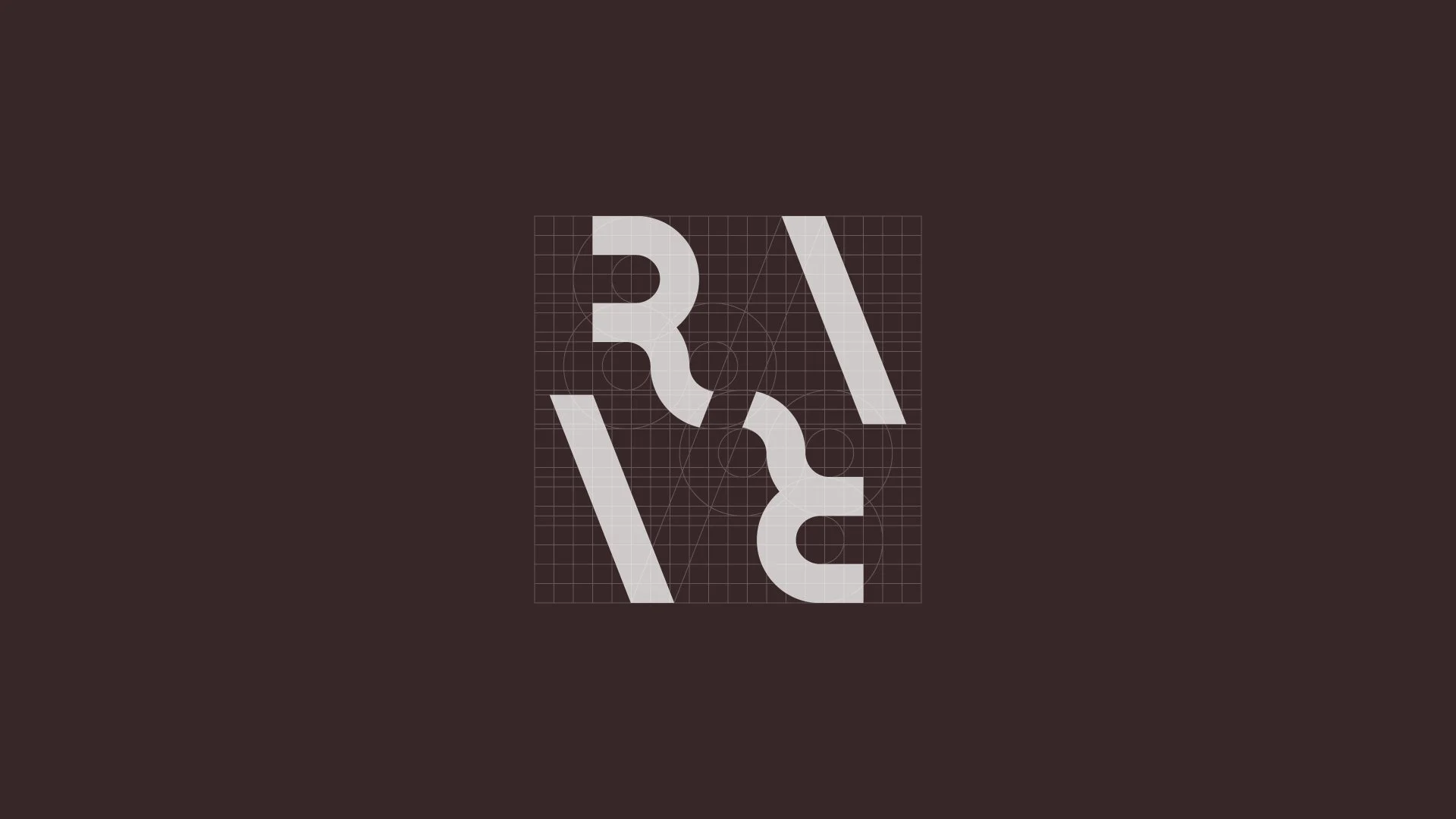
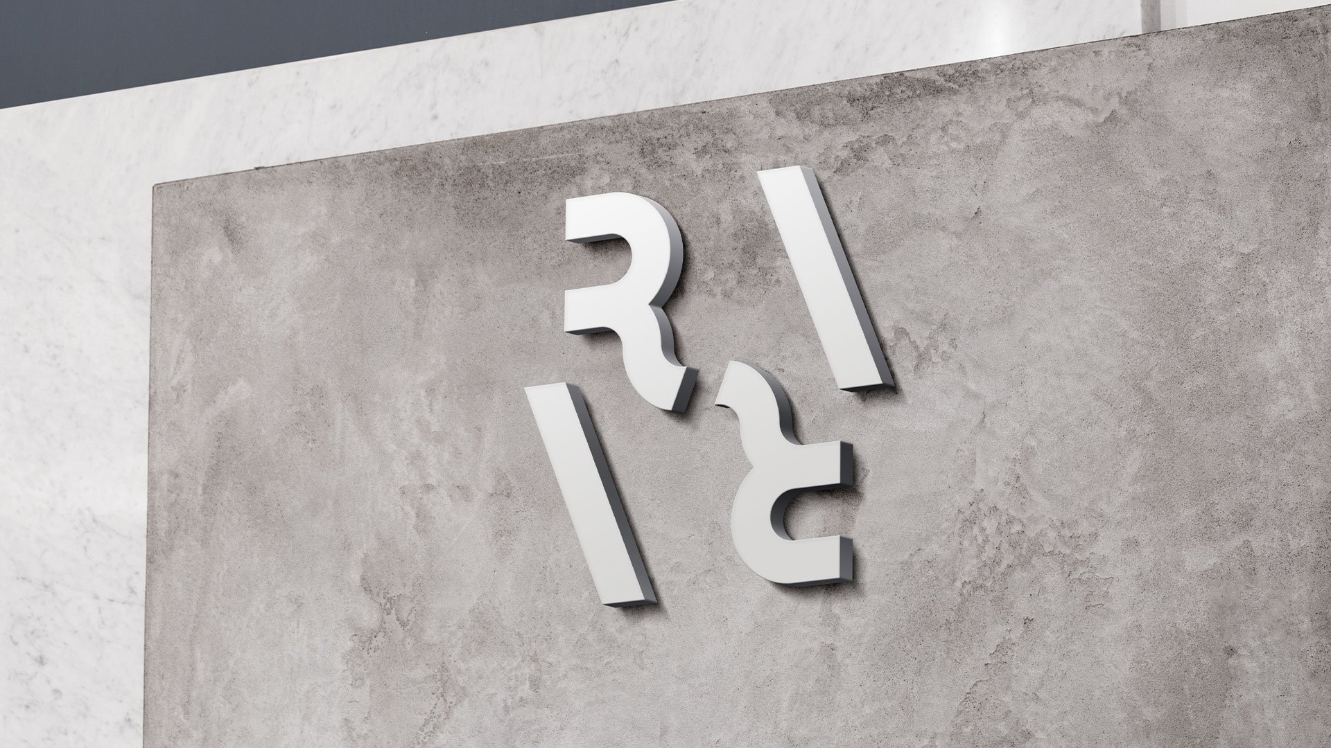
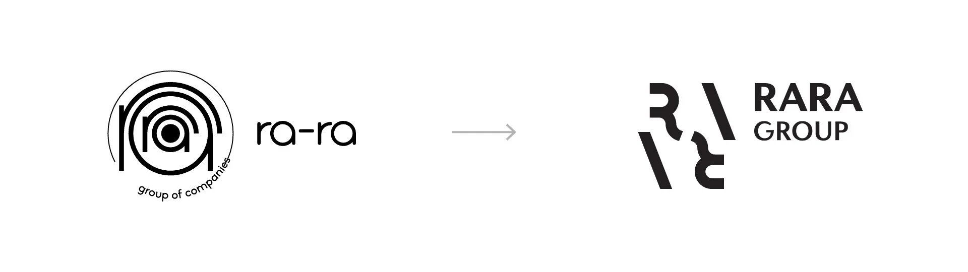
The construction of the symbol combines the four letters of the name in a symmetrical arrangement, conveying balance and stability. The letters are connected diagonally—the two letters "r" visibly and the two letters "a" by the invisible line formed by the arms of the letters—suggesting the connection between the companies. The two slashes in the symbol separate to set up distinct icons for each subdomain.
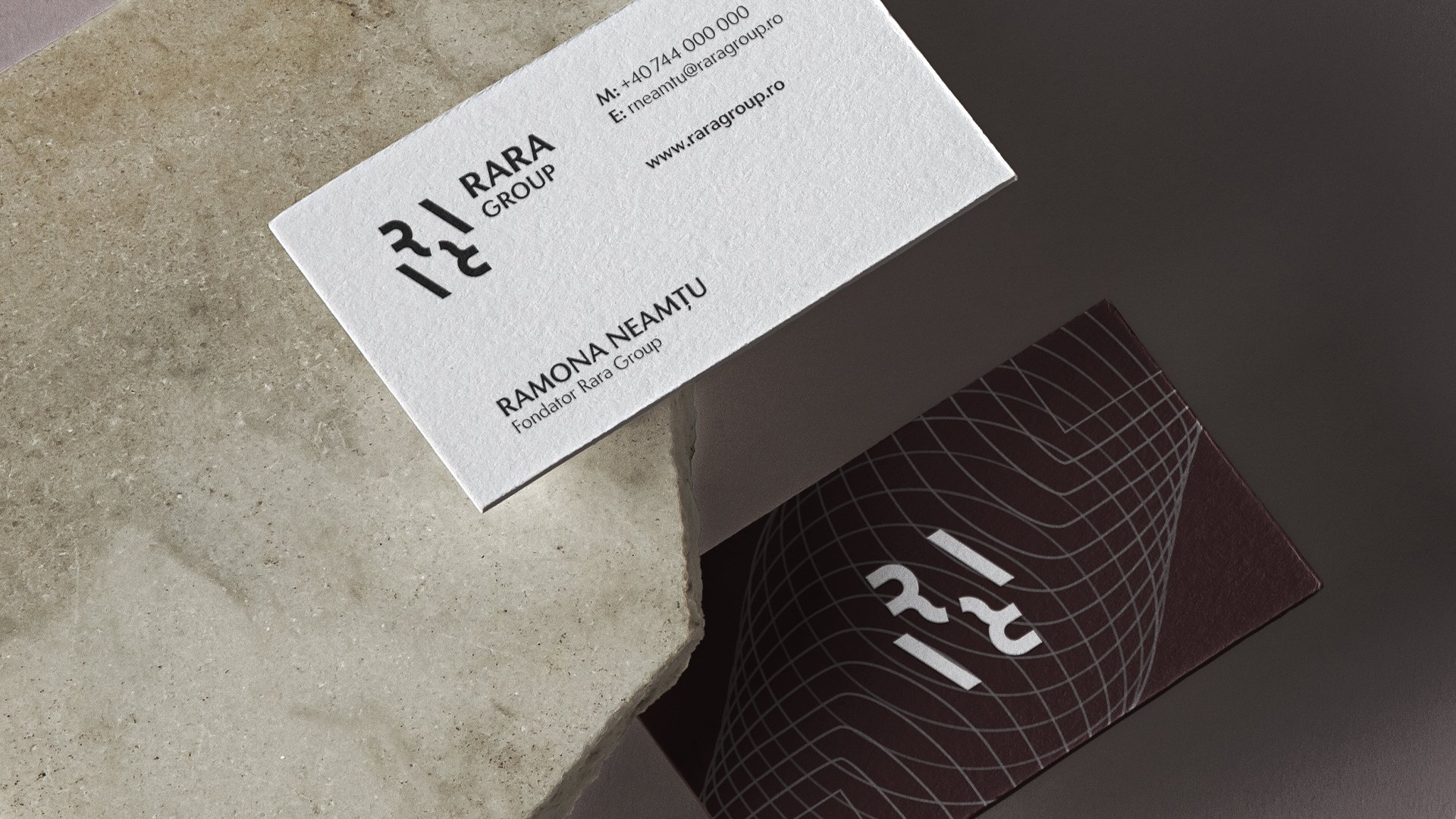
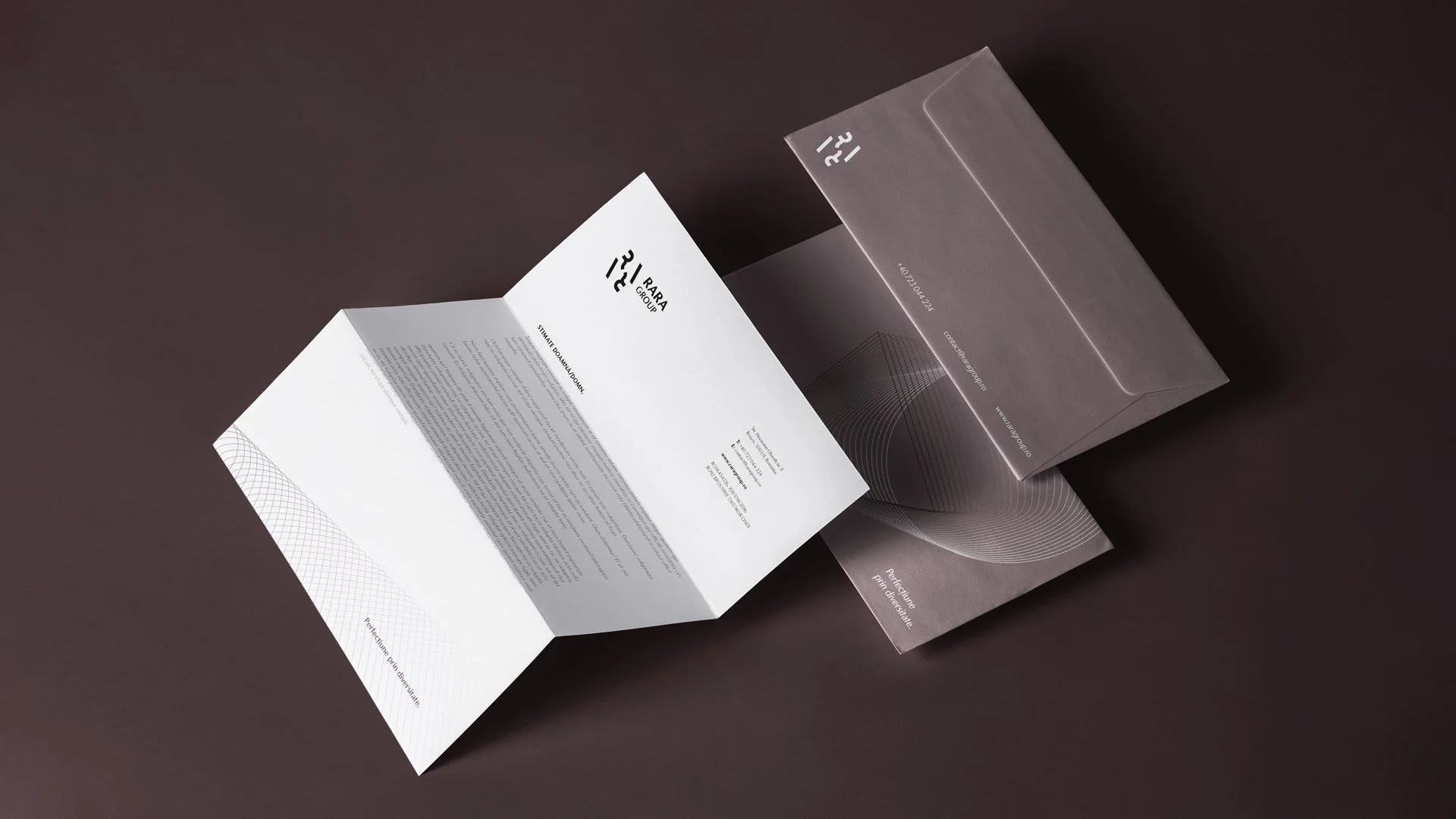
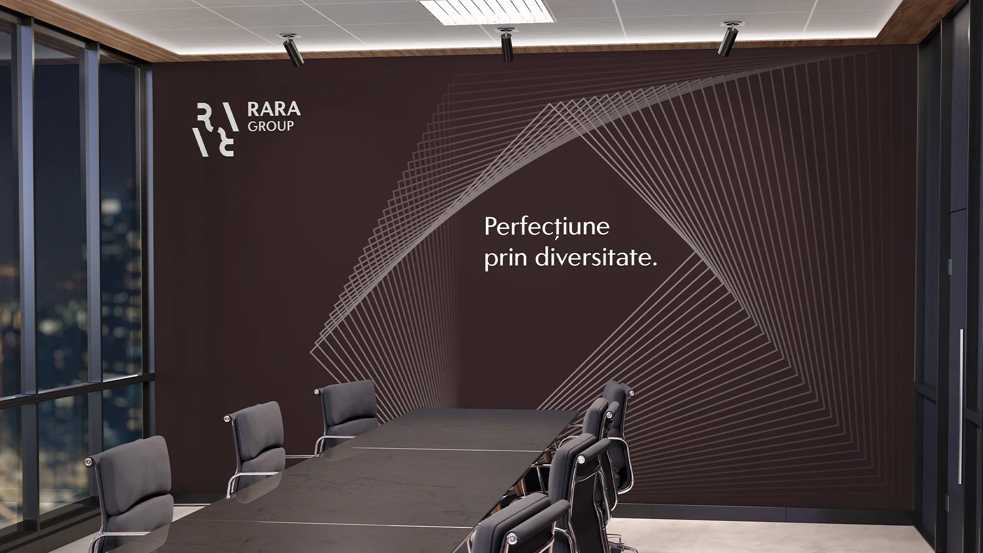
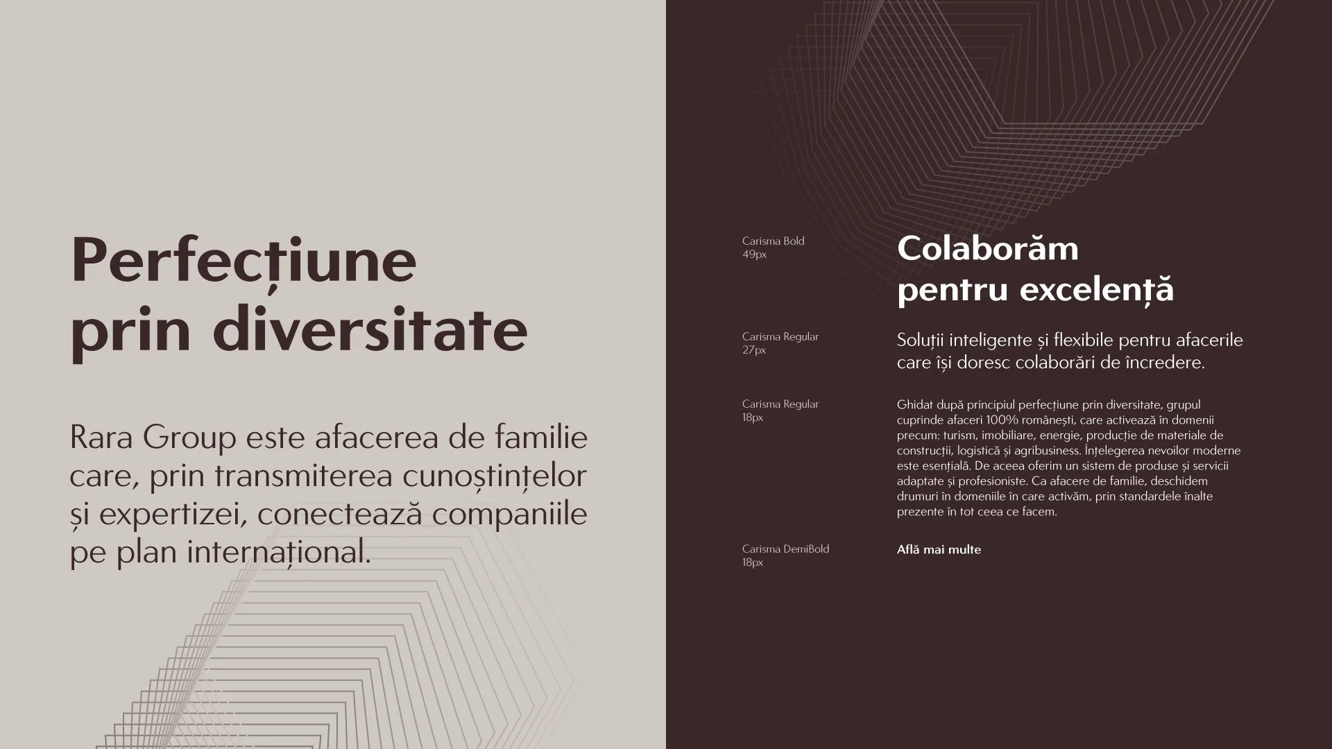
The typography system is based on the Carisma font, which was chosen for its geometric letters, subtle contrasts, and elegant feel. The color palette is based on a maroon-burgundy, complemented by distinct colors for each subdomain.


Taking inspiration from the diversity of Rara Group businesses, we developed a flexible graphic system that can be configured in multiple variations. The system is based on geometric shapes (circle, square, triangle, rectangle, and polygon) that blend together.